Designing emails isn’t just about coding and making sure they look good on different devices. Emails have to capture attention, build interest, and motivate readers to click through to your website or perform another action.
Sound like a tough job to accomplish with a single message? It sure is! But these 5 examples prove that it’s possible if you use the right visual elements.
1. Beautiful photography
Your emails don’t have to be very complex to capture your readers’ attention. Sometimes all it takes is a beautiful image in the header section that connects well with other key elements – the subject line, preheader, main offer, and the call to action.
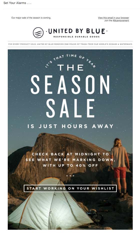
A brand called United By Blue does this exceptionally well. As you can see in the message below, their season sale is just a few hours away, just as is the sunrise in the photo they used. If the readers don’t want to miss this special occasion, they better set an alarm and start working on their wishlist straight away.
Another important aspect about this photo is the fact that it ties well with the products the brand offers. It mainly sells clothing and accessories for outdoor activities like camping. Using relevant imagery such as the one presented can have a big effect on how well emails will be able to convince customers to shop on a site.

2. Animated video
You’ve probably all read Jon’s blog post on adding videos to your email campaigns. It’s true that embedding video into your messages is risky. In most cases it just won’t work, as it’s not widely supported by different email clients.
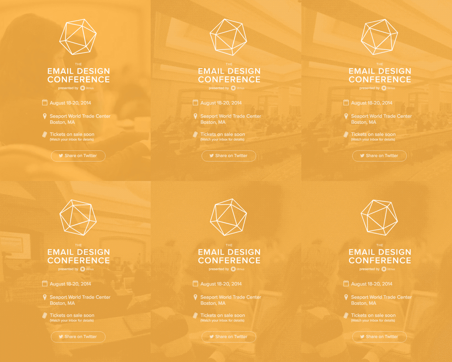
But when it does work, it can make your jaw drop. That’s what Litmus wanted to prove in the email invitation for their Email Design Conference in 2014.
As you can see in the image below, and can read more about in this article, there’s a hidden video background in the message (which runs more smoothly than presented in this GIF). Without making the subscribers click on any links they’ve managed to show:
- what the email is about
- what the conference is like
- what more one can do with email design
You can imagine this campaign generated quite a buzz and proved that the Litmus Team knows about coding and email design. And all it took is a cleverly animated video.

3. Animated GIFs
If you don’t want to add video to an email, you can try using GIFs instead and show some simple animations.
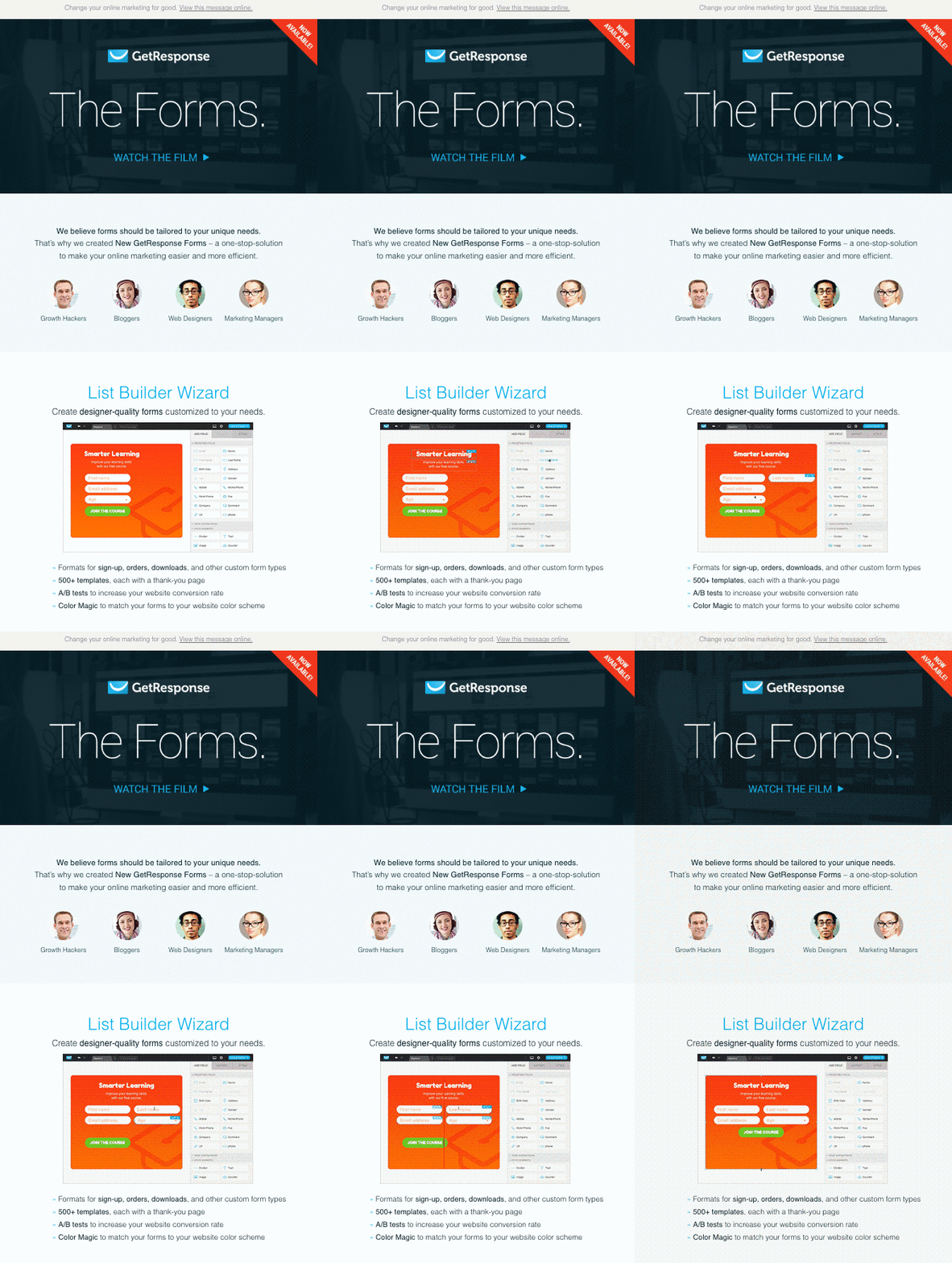
The GIF format is very popular and it’s widely supported by various email clients. In the past few years it’s become a common practice to use them to capture readers’ attention or show your product in action. This is exactly what GetResponse did when it launched one of its new features and wanted to quickly show it to their subscribers.
In this short animated GIF, you can see how easy it is to edit your pop-up form by simply dragging and dropping individual elements onto your workspace. Just as with the previous example, they managed to show the key benefits of their new solution without making their users click on any links or buttons.

4. Call-to-action buttons
Calls-to-action buttons, almost by definition, should be visible. But what if you could make it almost jump off the page? Sometimes there’s a way.
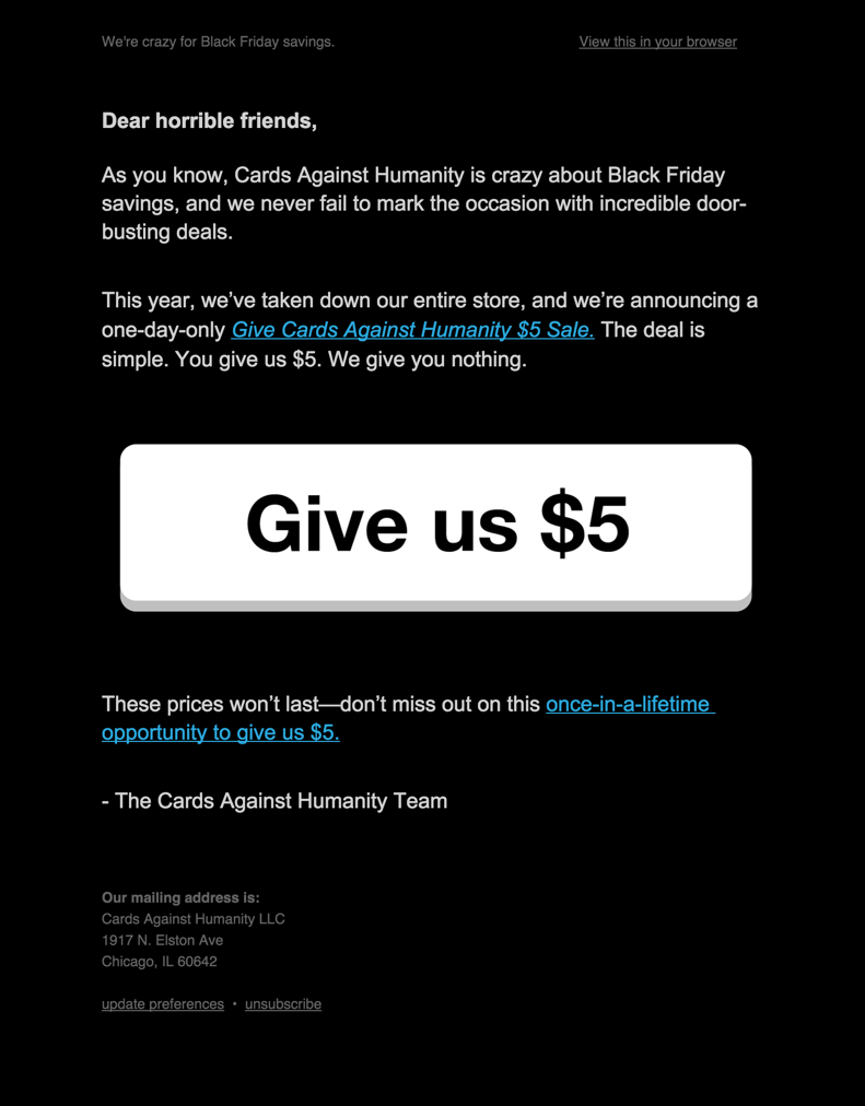
The Cards Against Humanity game is known for its particular, often inappropriate, sense of humor. Their whole communication style suggests they don’t care about the traditional standards or best practices written by the experts. And that’s probably why their email asking for $5 donations with a large CTA worked so well.
As you can learn from the message below, their premise was simple: they’re closing down the store for the Black Friday holiday, and if you give them $5, they’ll give you nothing in return. As crazy as this idea sounds, the Cards Against Humanity Team got $71,145 from this campaign, keeping all the money to themselves.
Of course, this doesn’t mean you should make your call-to-action buttons the same size as theirs. It does mean you should play around with the copy, button placement, and design to find the best way to catch your own subscribers’ attention.

5. User-generated content
Let’s be honest. Most stock photos don’t look real. Some of them have been used by different brands so often that users no longer pay attention to them. That’s why if you want to your users to react to your emails, ads, or landing pages, you’ll want to use unique photographs.
Finding the right images, especially ones that haven’t been over-used, may sound difficult at first. But it doesn’t have to be, especially if you use content created by your customers and fans.
Many brands, such as Me Undies, are great at sourcing new content from their users. They run online contests, promote using hashtags to show how customers use their products, and ask them for reviews. And guess what? You can do that too, and use the resulting user-generated content in your email marketing campaigns.
The great thing about this content is that it shows your products are used by real customers. Consequentially, other viewers can more easily imagine themselves using them. On top of that, these photos also tend to be more trusted than the ones created by Marketing Team.
The same goes for reviews, tweets, or emails. They can work just as well in your email marketing campaigns or in your ads, or as a part of your website. One word of caution though: be sure that you’re allowed to use them. If you’re unsure whether you have the right to do so, this article provides a good overview of when it’s appropriate to use social media content provided by your fans for your own campaigns.

A word of advice
There are a number of ways to make your emails stand out and attract your audiences’ attention. Before you get into optimizing your use of photos and videos, make sure that your emails are delivered well so that they reach your subscribers’ inbox.
At the same time, you should look at the elements that are seen before the message gets opened, i.e. the “From” name, address, subject line, and the preheader. All of these elements have to build trust and remind your audience about the value you’ve delivered to them in the past.
Once you get to coding your email, don’t just trust your gut feeling. Get scientific and if you’re not sure whether you’re using the right header image, just run a test. You’ll learn a lot from your subscribers, including what they like best in your emails.
What successes have you had using visual elements in your email marketing?
The post 5 Examples of Visual Elements Your Email Marketing Needs appeared first on Vidyard.
source http://www.vidyard.com/blog/5-great-examples-visual-elements-email/

No comments:
Post a Comment